Underwriters Adopt a Single Source of Truth Product
Problem
The risk analysis underwriting process relied on multiple Excel spreadsheets to determine insurance premiums. This was an outdated method of analysis that did not allow for efficiency and ease of use.
Goal
Construct a one-stop-shop tool for underwriters to analyze all risk categories for each insurance type to achieve a single source of truth.
Team
Product Owner, Project Manager, Developers, UX Designer
Tools
Sketch, Figma, Zeplin, Miro, Mouseflow, Illustrator
Timeline
Project has been ongoing for 4 years and continues to be built and released by insurance type.
Background
This project began in 2018 with the purpose of making the underwriter’s quoting process more efficient and modern. I took over as the sole UX designer in 2020. My goal was to successfully incorporate the established visual design into the future phases of the project, while also learning from the user in order to enhance their experience. Today, this tool saves underwriters over 2,000 hours annually. This project is still ongoing today and this study features one of the subsections of the tool, contractor’s equipment insurance.
User Research
As a team, we began with two weeks of upfront research to understand how the business unit wanted the tool to operate versus how the users currently used the Excel spreadsheets.
Using Miro, I sat down with the project manager and product owner to create a workflow diagram that represented the ideal process from the perspective of the business unit. It was important to complete this diagram before conducting user interviews because it allowed me to better understand how the user’s path may differ from the desired workflow.

After creating the business unit's workflow map, I conducted several user interviews. During these, I asked the users to walk us through their current process. I spoke with individuals of varying seniority to see how people with different levels of experience used the spreadsheets. I found that the most significant difference between experience levels was the order in which they completed their task; some skipped around the forms while less experienced users completed them in a linear order. It became apparent that only those with more experience already knew which fields were required and important to make a quote. I knew then that the biggest challenge was going to be creating a tool that would work well for all levels of experience.
After the user interviews, I created a new workflow diagram based on what we had learned. I made sure to include various paths, pain points, and possible friction points. As predicted, the actual user workflow was more complex than the happy path created by the business.

Before beginning the design process, our team worked with the users to create solutions for the pain points and friction areas by eliminating fields, changing the order of the content, and updating wording. These changes were needed to not only provide a better user experience, but they also helped the user’s workflow become more streamlined like the business unit hoped.
The Design Process
Taking what I had learned from both workflow diagrams and user interviews, I began my design process. Since other subsections of this tool were already developed and in use, it was crucial that my designs for contractor's equipment had visual consistency with the other insurance types by following exisiting design patterns and styling.
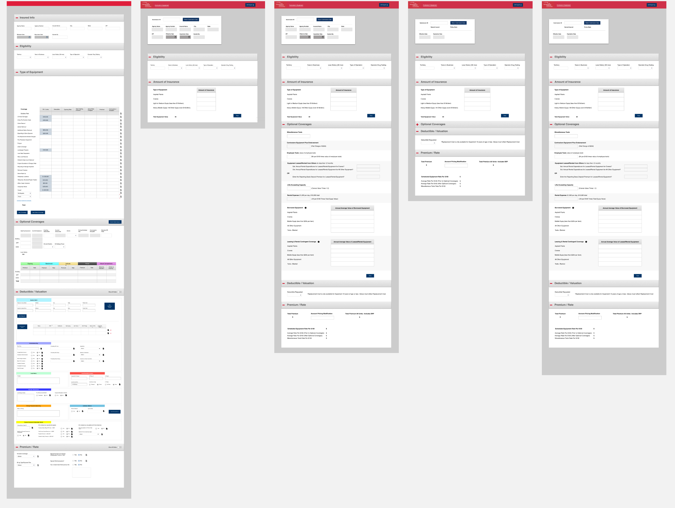
Based on user feedback, our team modified the layout to represent an accurate workflow, which helped with ease of use and efficiency. I created a few high-fidelity wireframes that I put in front of users for input.

Various Iterations
Design Solution
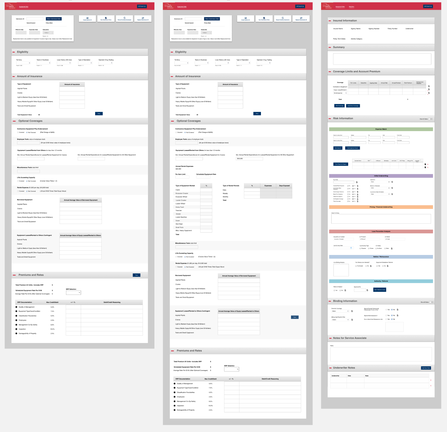
After several iterations, we landed on a design that both the users and business unit were happy with and was technically feasible for the developers. In the end, we completed the contractor’s equipment section of the tool within 3 months.

Final Design
Below is an icon I created using Illustrator to bring a small touch of delight to an analytical process.

Final Thoughts
This project was my first section of the tool that I worked on after taking over as sole designer. It was a unique experience coming on as the designer to a team that already had work delivered to the end user. It was extremely important to me that the users did not feel the transition between designers, as this tool needed to be cohesive in order to provide a good user experience. I do believe we have achieved that in this project since our team has received high praise for the efficiency this tool has brought to the company.
As of the end of 2024, we have doubled our usage of this product since 2023 due to our continued enhancements to the tool.