Claim Submissions for Gig Economy Get a Web-Based Product
Problem
Gig economy workers' only method of filing an occupational accident claim was by phone with an insurance agent. This format provided an outdated experience that was not user-friendly.
Goal
Simplify the user's claim submission process by constructing a web app featuring mobile-first design.
Team
Product Owner, Project Manager, Developers, UX Designer
Tools
Sketch, Zeplin, Miro
User Research
In the beginning…learn
As part of our agile environment, our team began with the Discovery & Framing process. This two-week timeline allowed us to collaborate with business representatives to learn about the problem before solutioning in order to reduce risk before delivery.
- My user research began with leading a customer journey mapping session. Our stakeholders guided us through the user’s journey, so we could learn how gig economy workers currently file occupational accident claims through the company. From this mapping session, we learned that the current workflow was a complex multi-step phone call process. We also learned a couple of pain points: inefficiency and poor communication. First, the user had to call multiple phone numbers to connect with the correct insurance agent. Additionally, the user was not informed ahead of time of the details needed to file a claim and was never updated on where they stood in the claims process. It became clear that our product needed to provide a streamlined digital solution for our end user.
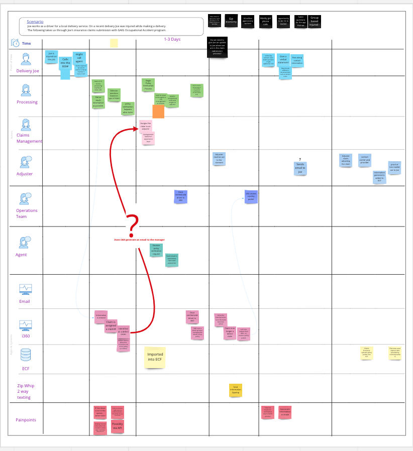
Customer Journey Map
- After this mapping session, our team conducted stakeholder interviews. Our goal was to learn any business requirements, constraints, or concerns before starting design and development. My biggest takeaway from these conversations was the need to balance the stakeholders’ concern of scope creep, while also ensuring we included features that would enhance the user’s experience.
As we concluded our Discovery & Framing process, I knew the importance of empathizing with the user, someone who had been in an accident. Most likely, the individual would be rattled from the situation; therefore, it was important that our solution made filing a claim as simple and clear as possible. Our goal was also to ensure a smooth transition to the digital format.
The Design Process
Up Next….create / present / iterate
Based on our findings, we determined the best solution to solve the user's pain points was to allow them to submit their claim via a digital submission process. Having a mobile-friendly web app would ensure they were provided with the information needed to file a claim without making a phone call.
My design process looked a bit like this:
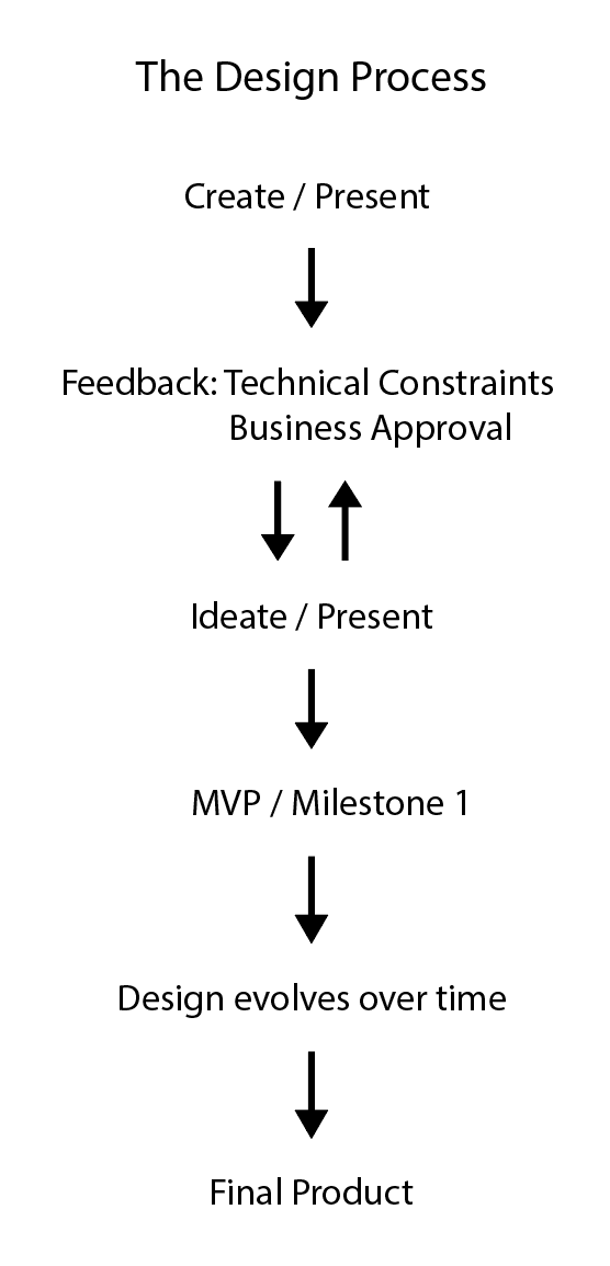
I created a series of wireframes with a mobile-first approach and then presented those to the product owner, project manager, and developers. From that presentation, I got feedback based on business requirements from the product owner and technical constraints from the developers. For this particular project, the company could not provide our team with end users to get design input, so in order to get further design feedback, I reached out to internal employees and my fellow UX designers. This process of iteration and feedback happened a few times until the team was happy with a milestone 1 design.
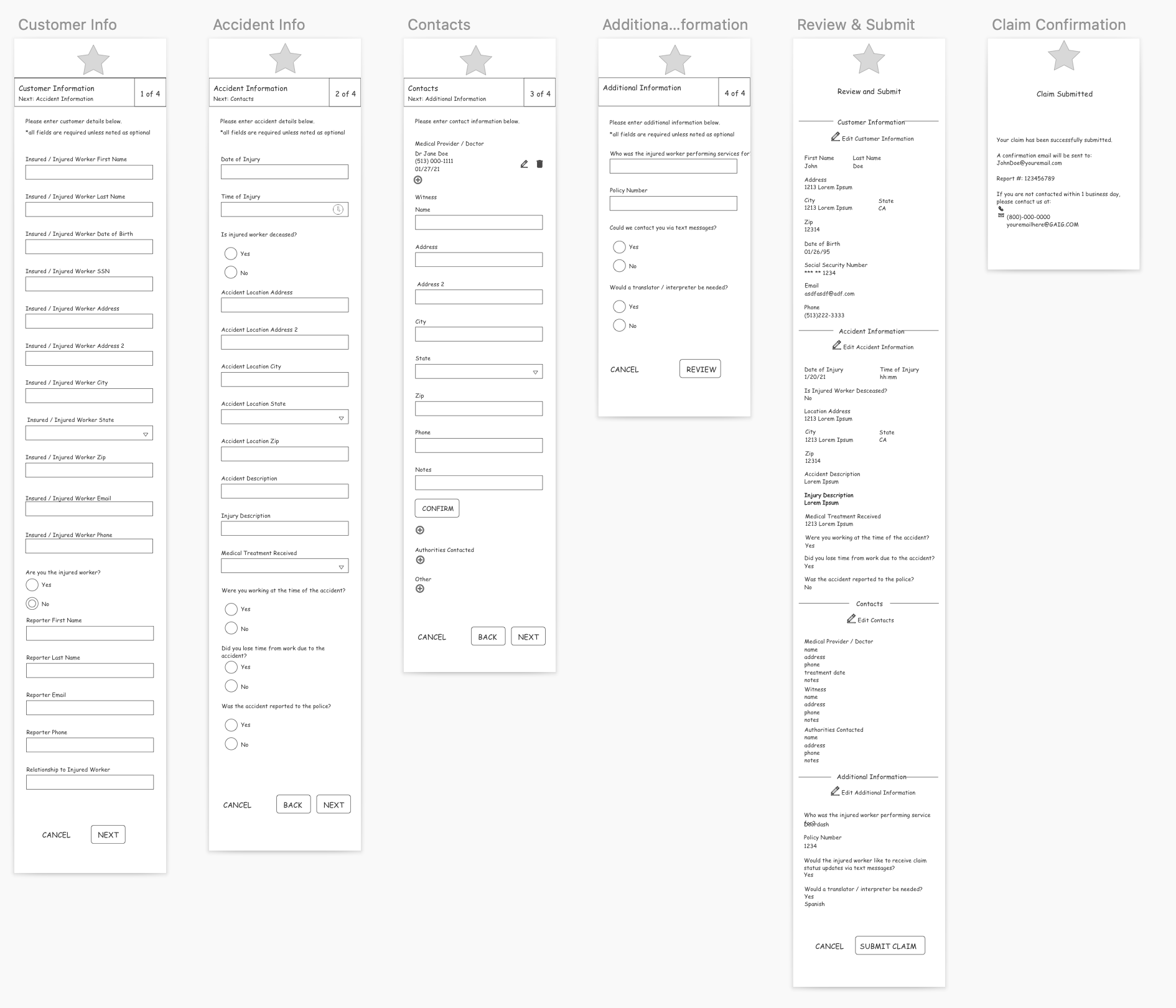
Low-Fidelity Wireframes
Over time, the design evolved with new features that included a desktop version. It was important for me to continue to work closely with the developers, so if a problem arose, we could find an appropriate technical solution that wouldn’t sacrifice usability.
Design Solution
In the end…the product is complete
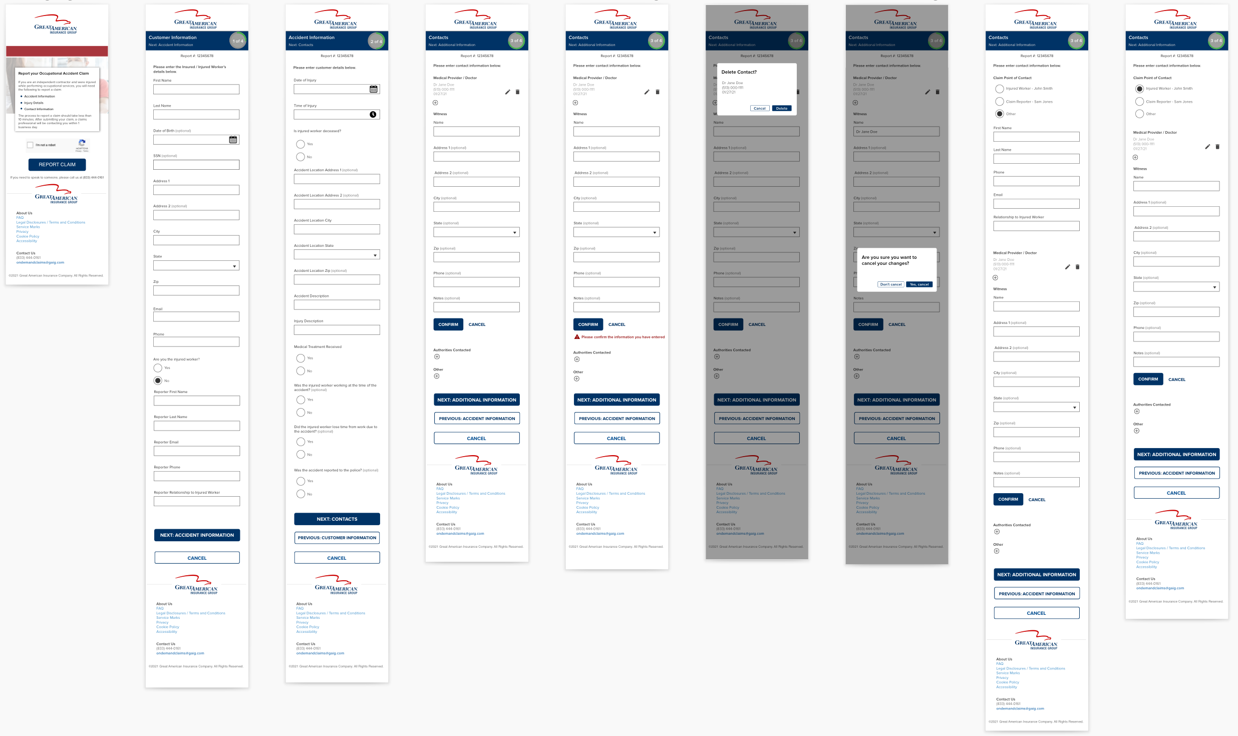


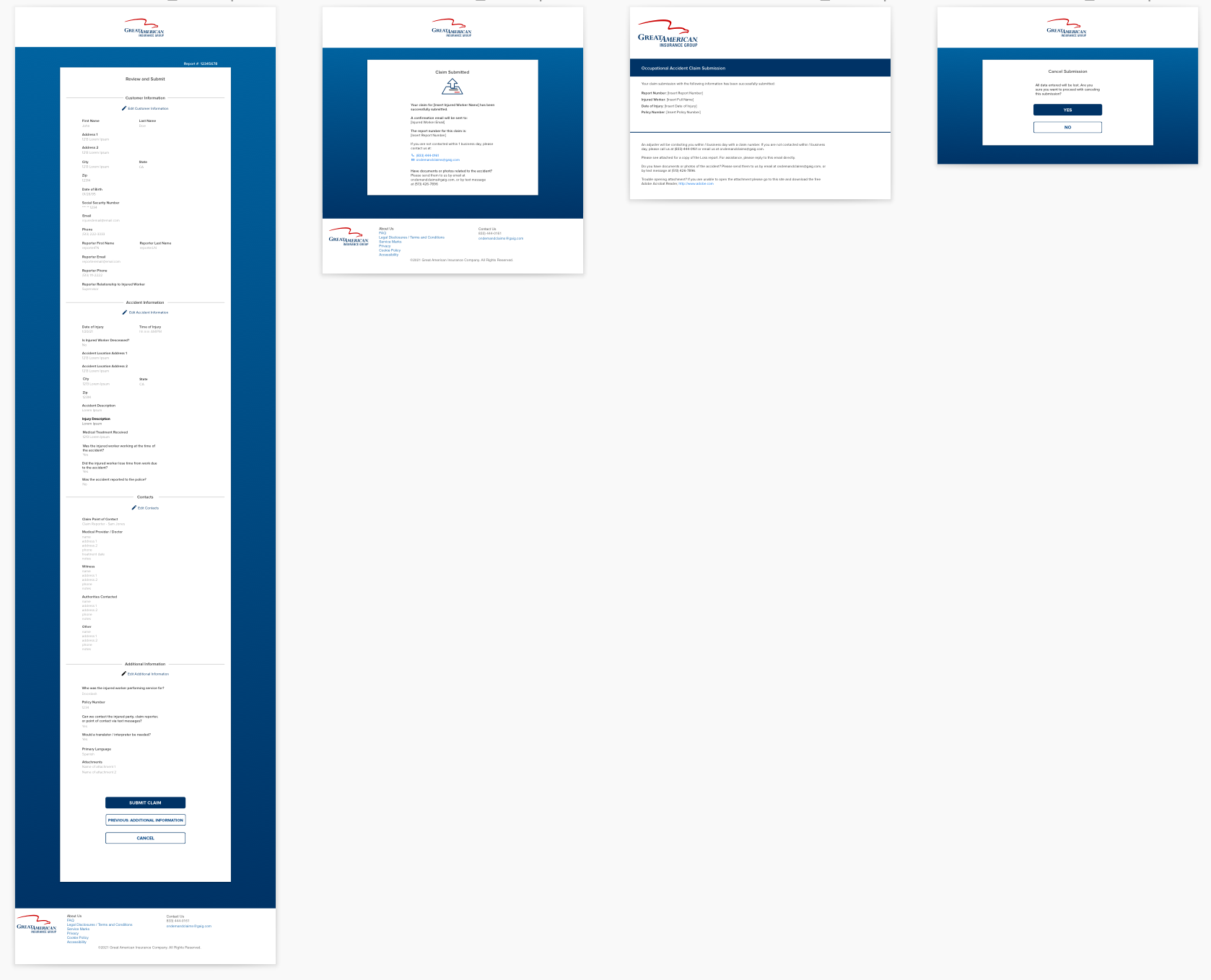
This project took about 5 months to complete both the mobile and desktop versions. The business representatives were very happy with our team's final deliverables. We also managed to stay within scope in a reasonable timeframe. We were also able to capture all major features needed for the user to easily file a claim. So, in the end, our team was able to provide a product that satisfied both the end user and the business unit.
Reflection
My biggest takeaway is realizing the importance of always finding a way to get design feedback. While I may not have had access to the actual end user, simply asking my co-workers still led to valuable discoveries. On a more personal note, this product was not only my first project where I was the sole UX designer, but one that I worked on from start to finish. I was impressed with how well our team worked together and how quickly we were able to complete this project.